NBA jerseys have long been a blend of tradition, innovation, and style, representing not only teams but also cultural moments in basketball history. Over the years, some jersey designs have become iconic, while others missed the mark entirely. Below is a ranking of the best and worst NBA jersey designs of all time, celebrating the hits and critiquing the misses.
The Best NBA Jerseys of All Time
1. Chicago Bulls (1995–1996 Black Pinstripe Alternate)
The black pinstripe alternate worn during the Bulls’ dominant 72–10 season epitomized Michael Jordan-era excellence. Its sleek black base, red detailing, and subtle pinstripes made it a timeless classic.
2. Miami Heat (Vice City Editions, 2018–2021)
Miami’s “Vice” jerseys brought vibrant colors to life, with neon pink, blue, and black drawing inspiration from Miami’s nightlife. These jerseys became instant fan favorites and a pop culture phenomenon.
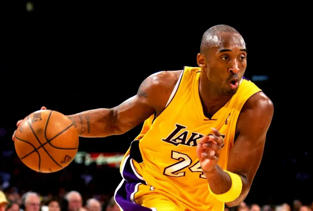
3. Los Angeles Lakers (Classic Purple and Gold)
The Lakers’ purple and gold is the definition of tradition. From Magic Johnson to Kobe Bryant, this design symbolizes excellence and has remained largely unchanged for decades—a testament to its enduring appeal.
4. Toronto Raptors (1995–1999 Original Dino Jersey)
The debut Raptor jerseys with the oversized red dinosaur and jagged pinstripes were polarizing at the time but are now celebrated as a hallmark of 1990s design. Nostalgia has solidified their legendary status.
5. Boston Celtics (Classic Green and White)
Timeless simplicity defines the Celtics’ jerseys. With their green and white palette and lack of flashy embellishments, these uniforms have stood as a symbol of tradition and winning since the 1950s.
6. Orlando Magic (1994–1998 Pinstripe Edition)
The Magic’s blue pinstripe jerseys with the bold star “A” in their logo perfectly captured the excitement of the Shaquille O’Neal and Penny Hardaway era.
7. Phoenix Suns (1992–2000 “Sunburst” Design)
The Suns’ iconic sunburst design, featuring a streaking sun over a purple or black background, was bold, modern, and unforgettable. It remains a favorite among retro jersey collectors.
8. Denver Nuggets (Rainbow Skyline, 1982–1993)
The Nuggets’ rainbow skyline jerseys are one of the most unique and beloved designs in NBA history. With a colorful cityscape against a navy or white backdrop, these jerseys stood out in every game.
9. Golden State Warriors (The Town Edition, 2017–2020)
Honoring Oakland, these jerseys featured a tree emblem inspired by the city’s logo. With clean black-and-white contrasts and cultural significance, they became an instant hit.
10. San Antonio Spurs (Fiesta Editions, 2020–Present)
The Spurs revived their classic “Fiesta” colorway with teal, pink, and orange, bringing a modern twist to their typically subdued designs. Fans celebrated the nod to 1990s San Antonio culture.
The Worst NBA Jerseys of All Time
1. Sacramento Kings (1994–1997 Checkered Side Panels)
The Kings experimented with checkered side panels in the mid-90s, and the results were universally panned. The clashing patterns and colors made these jerseys an eyesore.
2. Atlanta Hawks (1995–1999 Gradient Hawk Jersey)
While the giant hawk graphic was bold, the gradient background transitioning from red to yellow was overwhelming and messy. This jersey became more of a distraction than a statement.
3. Cleveland Cavaliers (2003–2010 “Wine and Gold”)
The Cavaliers’ LeBron James-era jerseys lacked inspiration. The dull maroon and gold combination with unremarkable fonts felt like a missed opportunity for a rising superstar’s team.
4. Detroit Pistons (1996–2001 Teal “Horsehead” Jersey)
Detroit’s teal era, featuring a flaming horse head, deviated drastically from their traditional red, white, and blue. The bold teal didn’t resonate with fans and is considered a design misstep.
5. New York Knicks (2013 “Orange Sleeved Jersey”)
The Knicks’ fully orange sleeved jerseys looked more like practice uniforms. Adding sleeves to an already vibrant design proved to be a distracting and unpopular experiment.
6. Los Angeles Clippers (2015–2017 Rebrand)
The Clippers introduced a redesign that was widely criticized for being too generic. The awkward “LAC” logo and uninspired typography failed to capture the team’s energy or identity.
7. Houston Rockets (1995–2003 “Pajama Stripes”)
The Rockets’ pinstriped jerseys with a cartoon rocket on the chest were chaotic and clunky. While they aimed for a futuristic look, the result was a widely ridiculed design.
8. Minnesota Timberwolves (2008–2010 Lime Green Alternate)
Minnesota’s brief flirtation with lime green alternates was short-lived for good reason. The garish color clashed with their typical palette and felt out of place on the court.
9. Milwaukee Bucks (1995–1999 Purple Deer Jersey)
The oversized deer graphic was meant to be intimidating but came off as awkward and overly busy. Combined with the purple and green color scheme, these jerseys were divisive at best.
10. Philadelphia 76ers (2013–2014 Sleeved Jerseys)
The Sixers’ sleeved jerseys during this period looked more like soccer kits than basketball uniforms. Fans and players alike disliked the restrictive sleeves and uninspired design.
Conclusion
NBA jerseys are more than just uniforms—they are statements of team identity, culture, and history. While some designs have become timeless icons, others have served as cautionary tales in bold experimentation. Whether celebrating classics or critiquing misfires, one thing is certain: NBA jerseys continue to spark conversation and creativity.
What’s your favorite or least favorite NBA jersey? Let us know in the comments!
